 Justwords iscelebrating 16 years of helping businesses grow through strategic digital growth solutions. 🤝 To mark this milestone, we're offering a FREE Business Consultation.
There are many misconceptions that home pages simply don’t matter anymore. Why bother with a perfect home page when you can just create targeted landing pages for each of your marketing campaigns?
But the truth is that the homepage is here to stay. Whether you like it or not, it’s the face of your company, especially when someone searches for you online. It welcomes new users and explains what your company is all about.
However, what is changing is the way we visualize and design home pages. There was a time when the home page crammed in as much information as possible. They tried to tell users everything they could in just that one page. But that led to extremely overwhelming and confusing user experience. For instance, many homepages had carousel sliders that allow you to showcase multiple things at once. But over time, tests showed that they ended up negatively affecting conversions, SEO, and page loading speed.
Today, homepage design is all about user experience. This means keeping things clean, simplistic, and minimal while telling users what they need to know when they first come to the site. Here are 5 diverse homepage design templates. Over the years at JustWords we’ve found that close to 85% of our clients’ websites fit into one of these design templates. You can figure out which one suits you best and adapt it for your own site.
Template 1: Mint.com
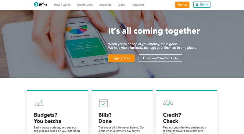
Mint is a budgeting app that people use to plan and manage their personal finances. With products like Mint that handles confidential financial information, designers always have to find that line between building trust and still being extremely user-friendly. The Mint homepage finds the perfect balance.
- The first thing that strikes you about the Mint homepage is that the design is extremely simple, without any added frills.
- The headline and sub-headline are strong and impactful but without having any unnecessary jargon.
- Their CTA is both simple and compelling – “Sign Up Free”.
- Finally, the homepage doesn’t try to perform too many functions at once. Its purpose is simply to tell you what the app can do for you and every section talks about this in different ways.
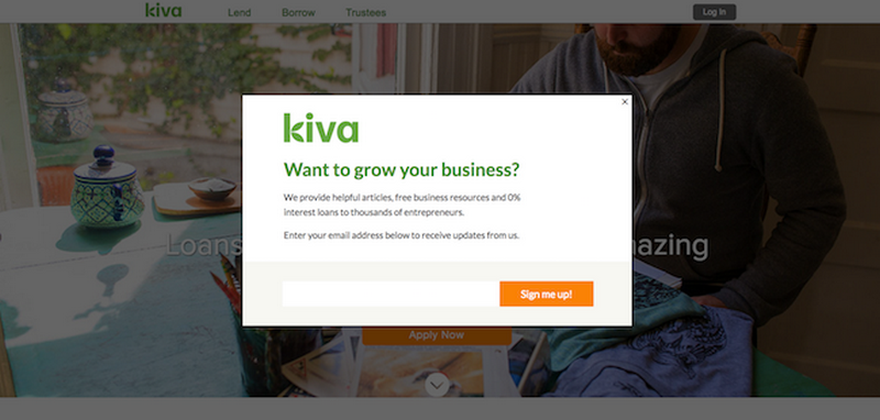
Template 2: Kiva
- Kiva is a microlending platform that connects smaller entrepreneurs in developing countries with sponsors and donors from all over the world. Kiva had a dual goalkeeping things simple and impactful while also motivating people to take action. Here’s what they get right:
Their template is extremely minimalist. The design is as simple as possible and there are plenty of white spaces. - The headline and sub-headline are really hard-hitting. Being an impact sector company, Kiva’s goal is to showcase the impact of what they do. And the headline and sub-headline together with the cover photo do this very effectively.
- Their home page feed tries to accomplish only 3 goals — build trust in Kiva, showcase the range of offerings and get people to take action. There is no overcrowding and confusion on the home page.
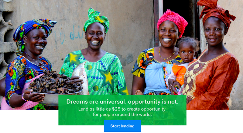
- Finally, Kiva also needed to find a way to make visitors understand what value they could get. Hence, they decided to go for a pop-up overlay with a simple email subscription. This can be a risky move that may backfire. However, with clever content and right timing, a pop-up overlay can exponentially increase conversions. Doing several rounds of A/B testing to find the right content and timing is the way to go.
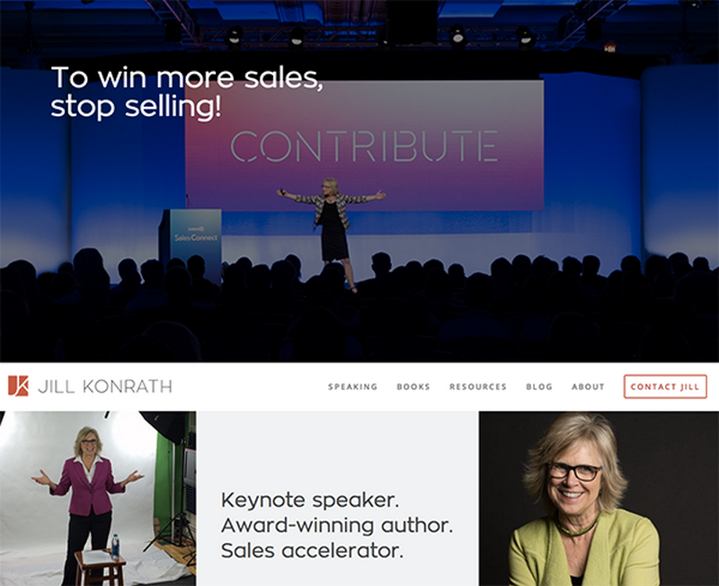
Template 3: Jill Konrath
If your business is built around your personal brand, Jill Konrath’s homepage is one template you need to see today. Whether you’re a life coach, a freelance copywriter, or a dietician, this homepage is personal branding 101.
- There are no frills and unnecessary technical terms. The headline and sub-headline tell you exactly what Jill Konrath is all about and why she’s so effective.
- A large part of Konrath’s website is about establishing her credibility as an authority in the sales field as well as her credentials as a keynote speaker. She has all her thought leadership materials as well as her press coverage prominently displayed on the homepage.
- With a personal brand website, there are two things that become even more important — making it easy for people to reach out to you and getting more subscribers to your content. Both the Contact Us and the Newsletter subscription are very accessible on the homepage.
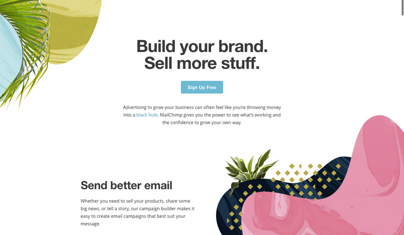
Template 4: MailChimp
If you want to build a homepage with a razor-sharp focus on conversions, look no further than MailChimp.
- MailChimp has just one CTA (Call to Action) button above-the-fold on the home page. Above-the-fold refers to what you see when you first click on a website without scrolling down. In a way, this completely reduces the choices the user has when they visit the website. Given that more choices actually lead to higher decision times and sometimes no decisions, this is actually a good thing.
- MailChimp also uses negative spaces or white spaces very effectively. All the white space around the primary CTA makes it that much more prominent.
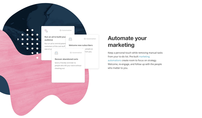
- The MailChimp homepage also uses a photography trick called the “rule of thirds” which means it puts the most important elements in the middle of your line of sight. In the example below, the design is helping you subconsciously prioritize a page hierarchy.
Template 5: Evernote
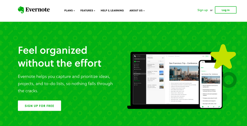
Evernote is a really interesting homepage design because, over time, the product evolved from a simple notes app to a whole range of productivity software. This could potentially make for a very messy website but Evernote navigates this problem successfully.
- Evernote emphasizes on the broad range of its tools but summarizes them into a few important benefits. This keeps the messaging simple but still shows customers the range of functions.
- The background colors are rich and muted which in turn makes the CTA (Sign Up for Free) more prominent.
Conclusion
Your homepage is the storefront of your online business and you need to approach it a way you would approach your product. This means user experience always comes first. The fewer options there are, and the easier it is for users to make decisions, the more effective your homepage will be. Don’t forget that every homepage has one ultimate objective — lead generation. The design template you choose to get you there will depend on your product, the target audience, and your brand voice.