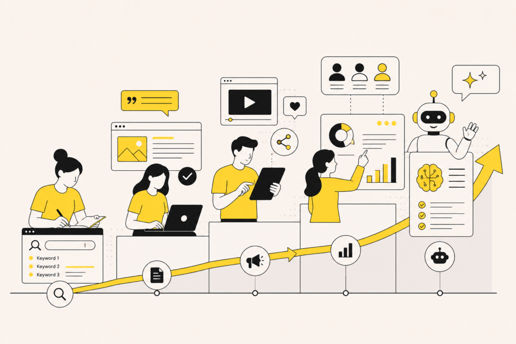
The content marketing game is changing slowly but steadily. There are still hordes of blogs and content produced in the world but only a minuscule percentage of it manages to catch our attention, resonate, or go viral.
While you may already have a solid content plan charted out for 2018, have you stopped to wonder how it is different from your 2017 plan?
Have you factored innovative forms of content presentation into your strategy? If not, this is a great time to modify your plan a bit.
There are two aspects to this plan:
a. Great Content
While we can’t fit in a universal definition for ‘great’, we all know that it is the type we all like to read with a cup of coffee, right until the end. It is filled with, data, insights, nuggets of wisdom, a-ha moments and the magical touch of humour. All of it together makes you believe that the piece was not written generally but somehow targeted at you.
As far as this bit goes, nothing has changed. You still need to sweat it out, collect data, type, edit and then type some more until you get the desired result.
b. Great Presentation
We’ve spoken at length about the importance of imagery and the use of infographics before but the way we present content now is changing. It is not just headlines, text and images with highlights for quick scrollers. It is interactive and truly engaging where the user dictates how they want to proceed with the narrative.
In this type of content presentation, the images literally bring the story to life helping you better imagine or understand the conversation in context.
Going forward in 2018, your regular blogs must have great content but once in a few months, you’ll have to pull a rabbit out of the hat and create a mix of great content and great presentation. This will require everyone from a graphic designer to an animation specialist to a big data wiz to an expert wordsmith to come together and create a masterpiece. Are you up for the challenge?
Here are bold new things to try out in 2018
1. Interactive Design
We know that Parallax design has been around for a few years now. Yet, we see very little of it used for designing blog content. The fact is that you can package your content so well within the design that your readers would live to scroll until the end without feeling text-heavy.
The example of rehabs.com who created a page on the effect of illicit drugs on America. You can click on the first ‘shovel’ to ‘dig into the problem’ literally. The content citing statistics are equally compelling. Imagine that the USA has spent 1 Trillion dollars since 1971 to fight drugs and the war continues to only get worse. It leaves you in a bit of shock and awe to see the numbers multiply under ‘Lines of coke smoked in the U.S. while you were reading this’ section. As crazy as it sounds, for a second we contemplated jumping out of the article to make the numbers stop.
The story here isn’t created in a standard blog format. It is neither a static infographic. Instead, if forces you to scroll wondering what to expect next. Last, but not the least, it makes an effective call to action (CTA) in favour of the content publisher. You can equate the publisher to not only be an authority on the subject but also as a crusader willing to fight the problem.
2. Face-averaging stories
Most people think of themselves to be in an average bracket in life traits. They are average in school, college, at work, in skills and at life in general. This interesting reason propels the ‘average’ mind to check statistics about averages.
Using latest technologies, you can average hundreds of facial images to show your readers what an ‘average Joe’ looks like. From criminals to celebrities to successful professionals, you can choose topics that have the inherent quality to go viral because the final picture will be something no one else will have. Want to check out how this works? Try FaceResearch.Org
Wondering what the ‘average’ woman looks like? The Daily Mail blended thousands of faces of women from around the world to find the answer. This is what it found:
3. Playing on User Generated Content (UGC)
Users love to share content. Sometimes they do it because they’ve either loved or hated your products and service. At other times, they do it for a small incentive. In either case, if you get your hands on a good collection of UGC, you can do more than a simple slide show.
Several brands have taken UGC to reinvent their brands, create commercials and generate awareness. Even if you don’t have such agenda, you can still use UGC to create ‘different’ content.
The New York Times, for example, created an interesting page featuring user photos of the 2017 solar eclipse as it moved across America. It makes you want to scroll down until the very end to see people’s reactions to the eclipse.
In 2012, Ray Ban partnered with Breakfast to use a system that analyses people’s Instagrams as they are taken and builds a large scale mosaic out of them. This time-lapse video of it is quite captivating.
4. Cursor Tracking
It is one thing to feel strongly about a particular topic. It is a whole different thing when you compare your feelings with others. Cursor tracking technology allows to track your mouse’s moments and clicks around your computer screen. It can show how people voted or felt about a particular topic or person.
A similar technology is already used extensively in creating analytical heat maps. But a slice of this technology can be used in content creation too.
From scales to graphs, you can use different ways to check user intent and then showcase how it measures against others who voted.
See a cool live example of this on Donottouch.org. We bet you can’t stop until a good minute into the activity. And if you stick on until the end, your pointer will be added to the video within an hour (not that you’ll be able to find it easily).
An example of how this feature is used in content comes, once again, from NYT which cleverly created an interactive graph of GoT getting users to fit in characters based on how they perceived them – beautiful, ugly, good or evil.
After you complete the exercise, you get to see how your placement works against the average placement of the character by the crowd.
5. Live updates
Live updates are one of the best tools that can be used by news websites or in general when you are covering an event. The most common example of this is the election coverage where the stats are updating as the vote count comes in. NDTV India covered the 2017 elections live giving minute by minute update. The page had additional content about how individual candidates fared and which party won in which constituency.
Sports is the other sector where this can be used effectively to track a game. It encourages users to either stick to the site or visit it multiple times to check what’s happening. The recent India v/s South Africa cricket match scores come as a small pop-up at the bottom of the screen that automatically refreshed as the match progressed.
You can also use live updates to track events with the latest news and photos popping up front and the older photos seen as you scroll down. Cannes red carpet anyone?
6. Projection charts
If a crystal ball isn’t your most trusted source for a peek into the future, then data is. Using current data sets, you can create projection charts to know how things will progress or worsen in the future.
Projection charts work wonders especially when you have something bleak in the future which will make people sit up and take notice. This comes easy when you have topics like ozone layer depletion, climate change, and pollution.
Take a look at the National Weather Service website that uses a combination of user input to generate information about the weather on the map which helps visualization.
For a more accurate representation of this topic, have a look at the Environmental Protection Agency website that paints a slightly scary picture of the world if temperatures continue to rise and greenhouse gas emissions continue to rise.
7. State Maps
State maps are another great way to break down data by geography. Most people will have a natural interest to see how their state fares in comparison to others with respect to a particular topic.
From alcohol consumption to sex ratio to literacy, a lot of data can be mapped in an interactive manner. Sporcle, for example, created a quiz with an interactive map of India.
8. Animated / Interactive Infographics
Infographics, if done well, are a sure shot way to gain viral visibility. Now imagine making it interactive where the user gets to control the flow of the information or the way the content is presented. It can be one of the coolest forms of engaging content and is a must-try this year.
BBC Earth created a unique interactive infographic that allows you to add in your birth date and then shows how the world has changed since you were born. We bet that most people first try their own birth dates and then their parents’ birth dates to do a comparison.
Take a look at this infographic that is funny and depressing at the same time! It tells you how long it takes John Paulson, a multi-billionaire super trader to make your annual income. Apparently, if it takes him more than 5 secs, you are ahead of the curve.
Scroll below at your own risk because the infographic will also show you how many gazillion years it will take for you to make his income. Sigh!
9. Animated Reports
Our most favourite annual report comes from Mailchimp, who has set the bar by creating a vibrant and unconventional one. While you can find standard figures like total employees and new hires, you will also know that the team collectively had 525 donuts, consumed 3640 pounds of coffee and even quirky facts like their employees collectively had 23 children or 950 water balloons were thrown during the intern water balloon fight! The whopper – Mailchimp customers sent a total of 246,148,661,219 emails!
Also have a look at L’oreal’s 2014 annual report. Created in magazine style and lush with colours, it makes you want to go through each of the reports in detail, making it a complete breeze.
10. Diagrams
Diagrams aren’t new in the digital space. They’ve been used to give a quick image representation of facts and figures. But in the emerging content space, diagrams can be used to spruce up boring content and add a new dimension to it.
You can take the same old flow chart to depict something entirely new. Have a look at this.
11. Comparison Graphs
The comparison often leads you to brainstorm new content ideas. You could either be directly compared with your competitor or brands within the sector to see how they match up.
They also have an instant curiosity value as people will want to see where they fit into the graph.
Movehub, for example, mapped the cost of living around the world. We don’t know what to make out of the fact that India is counted among the countries with the lowest cost of living. Surging onion prices ensures it doesn’t feel like it.
12. Timelines
What better way to take boring elements out of history than using a timeline! All you need is a quick stroll scroll down the history lane. Some journeys make the audience thankful for being where they are, others make them feel sorry for those whose lives have been marred in the timeline.
From a marketing perspective, you can either show the evolution of your company, brand or just the product to spike interest levels.
Take this visual history of virtual reality headsets. All we can say is that we are glad for the design evolution and that we no longer need to look like Cyclops to try this.
13. Memes
Memes, like diagrams and infographics have existed for quite some time. But they can add a refreshing new dimension to your content mix this year.
Memes tend to go viral because you want to instantly share the joke with your friends or tag a friend who ‘understands’.
In marketing, memes can go viral if they are topical. Take Norwegian Airlines for example that ran this meme which spread like wildfire. It was topical and came right after the Brangelina split.
A destination management company of a popular beach destination in India shared this meme on their Facebook account. It received more than 21000 shares because it instantly resonated with the brand’s audience.
14. Image Sliders
If you have a whole array of images and want to grab attention, an image slider is a great way to do it without making your audience scroll too long.
There are two types of image sliders, the regular one – like here, where you can see how people interpret the perfect man in their country or like here where you have transitional image sliders featuring two images side by side. You can slide from the middle to witness a before-after sort of effect.
15. Calculators
From knowing your BMI to calculating the amount you need to save to have a retirement plan, calculators are effective in engaging users to share personal information.
Did you know that it is recommended for Indians to have an ideal BMI of 22.9?
HealthyIndia is one among the many sites that allow you to not only calculate your BMI online but also heart risk, stress, calorie, smoking, and diabetes. We bet you want to know where you stand!
From a marketing perspective, it is great to provide a calculator that can showcase the benefit of your product and lead to purchase intent. Insurance policy sites like Policy Bazaar actively use these calculators to push out deals from third parties to their customers.
Conclusion
A lot of these examples now show that content is not a stand-alone medium. The next-gen content needs a good mix of visual appeal to tell a better story and leave an impact.
If you are looking for exciting and refreshing content ideas, do connect with us to know how we can help your brand.