Oops, Google has done it again! It has brought about another mega revolution in internet affairs with its 21st April deadline of a major algorithm update. Simply translated, Google will be expanding its use of mobile-friendliness as a ranking signal for websites. This means its high time website owners pull up their socks and get their sites mobile-friendly to face the Mobilegeddon if they want to stay in the run.
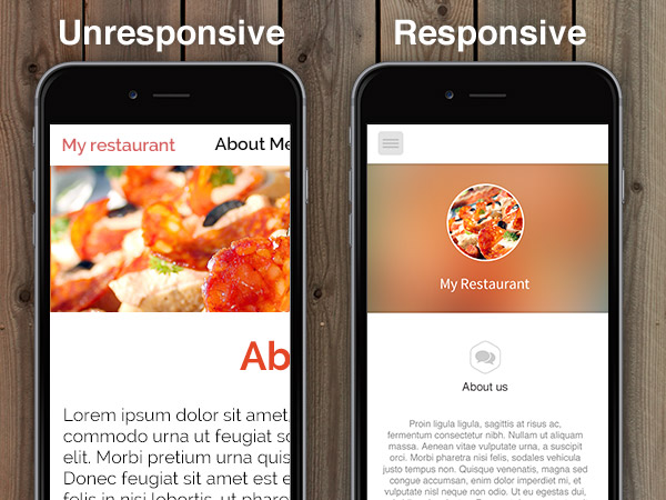
So does this mean that we all create of our websites to fit the mobile screen?
The answer is NO.
Mobile optimization is much more than that. Simply creating a mobile-friendly site will not do, the CONTENT needs to match up too.
Very often we make the mistake of using the same content for the mobile-friendly sites as we do for the desktop sites. And herein lays the mistake. Like the Smashing Magazine points out “you may be losing users if responsive web design is your only mobile strategy.” In other words, you need to know how to write the content for your mobile site too.
In case you are wondering how, here are a few tips for some rocking mobile-friendly content:
Be Precise and Concise
The precision of content to suit the target audience is extremely important. You need to identify your target segment and tailor content accordingly. Unlike computers, even the biggest of mobiles have comparatively smaller screens. Which is why using verbose content isn’t a great idea. Stick to short and crisp sentences that drive home the point without being bulky.
Picture Perfect
People love pictures. Period. Make use of interesting and catchy images to adorn your mobile site. Pair them with short and catchy captions and we guarantee you an increase in visitors.
Remember to keep away from heavy graphics that take aeons to load!
Headline Alert
Do away with long and boring headlines and switch to short, catchy ones to keep the audience glued. No one is going to click on the content if your headline gives it all away. Retain the mystery.
No Pregnant Paragraphs
When writing content for mobiles, always remember to stick to short paragraphs. As the U.S. News explains, “Reading long paragraphs on your mobile device requires concentration – something people using a mobile device generally don’t have.”
So break up your content into small readable chunks that maintain the flow of the article.
Better, Not Less
While keeping it crisp, short and simple is recommended, it does not mean that you wring all the meaning out of the content. Users on the go will read articles and will browse sites. You just need to ensure that all the text is presented in a readable format.
With almost every website ready to join the mobile-friendly wagon, you need to do something different and creative. And this difference will come from quality content, so don’t lose focus on that.